Join’
A social app designed to combat loneliness by connecting users to communities, clubs, and events based on personalized hobbies, interests, and causes.
Project Type: Academic Casestudy
Role: UX/UI Designer
User Research
User Stories
Wireframing
Usability Testing
UI Design
Tools: Figma / Invision
Duration: 10 Weeks
Overview
Inspired by the lockdown and stay-at-home orders during the pandemic, for my capstone project completed over the duration of the immersive UX program through BrainStation, I decided to look into the issue of the rising number of loneliness in US adults.
Loneliness and self-isolation are problems that many encounters at some point in their lives. While it may be a temporary stage for some but for others, it is an ongoing issue and a state that can be difficult to get out of and can leave detrimental effects on physical and mental health.
The reports on loneliness in American adults are staggering and the numbers show they have been getting worse.
Problem Space - Secondary Research
In 2020 Cigna surveyed 10,400 adults, out of those surveyed 61% reported that they were lonely, a seven-point increase from the same loneliness survey done in 2018.
Research also showed that Millennials are reporting higher numbers of loneliness than earlier generations.
71%
of Millenials reported loneliness compared to half of Baby Boomers (50%). (Cigna 2020 Lonliness Report)
30%
of Millennials reported feeling lonely compared to Gen-x at 20% and Baby Boomers at 15%. (YouGov in 2019, out of 1,254 US adults)
When left unaddressed loneliness can have a 29% increase in mortality and a 15-year decrease in life expectancy. It has the potential to lead to anxiety, depression, and even thoughts of suicide.
Learning more about these sobering facts led me to my how might we statement:

How might we improve the overall well-being of adults by decreasing their levels of loneliness?
Seeing how loneliness is especially an issue for Millenials I decided to target my solution towards that demographic.
Primary Research - Interviews
To gain a better understanding of the individual effects of loneliness from my target demographic, I interviewed 5 people (three men and two women) all within the age group of 26-36. While I would have wanted to conduct more interviews, because of the limited timeframe of the course, I was only able to find and schedule the minimum amount for the project. I asked them questions relating to their experience with. Some examples include:
Loneliness
“Could you give me an example of your first actions/impulses when you first start feeling loneliness or isolation?”
How do they try to reduce the feelings of loneliness
“Could you explain any action that you did to relieve those feelings?”
When they all felt the most connected in their lives
“Can you describe a time when you felt the most connected?”
To organize their responses to make it easier to find any patterns, I assembled their responses into pain points, motivations, and behavioral categories.
Insights
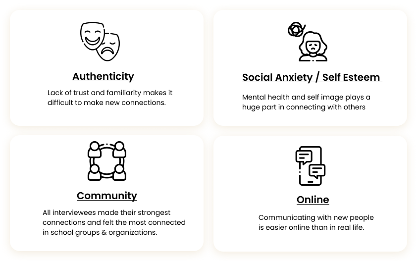
All of my interviewees had unique stories and personal experiences with loneliness. But when it came to how they formed connections and met new people, these were the common themes that were brought up in all of their responses.
Persona & Journey Map
To help identify the moments of opportunity for a design solution I created a persona and user journey map based on the pain points, motivations, behaviors, and insights I gained from the interviewees. I made sure to include the common roadblocks or challenges my interviewees had faced when trying to or wanting to make new connections.
Persona
Journey Map
Solution
After evaluating the common insights from my interviews and finding the opportunities from my persona & journey map, I had an idea for what elements I wanted to include in my solution.
Recreating the shared environments of school clubs & communities based on shared interests
Detailed event filtering that allows users to find exact events
View groups & events occurring near to be more connected to the local community
Option for online communication, for those who feel more comfortable speaking to new people digitally
Opportunity to stay connected after events through online text-based communication
To support my solution, a survey done by YouGov in 2019 found that Americans made new connections and friendships in their social environments. 76% reporting that they made at least one friend at work, 61% in local neighborhoods, and 44% through their spiritual or religious communities.

My design solution would aim to provide an opportunity to replicate these community environments for socialization for those who can not find them or don’t have them in their lives.
User Stories & User Flow
For my capstone project, I decided to focus on one of the main features of the app: finding community events. I chose to focus on designing this feature because it is the main way for user's to start building the foundation for creating new relationships.
Each one of my interviewees was unique in how they enjoyed socializing and knew what type of environments they did and did not like to make new connections. So I included a filter with details that gives the option to users to find the events they feel the most comfortable socializing in while also fitting their schedule.
I wanted to emphasize community, so included a map view to allow the user to visually see what’s going on in their area.
User Flow
Sketches to Initial Wireframes
I sketched out the main elements and screens from my user flow and then translated them into my initial wireframes to begin usability testing.
Wireflow
Usability Testing
To find any usability issues and opportunities for improvement in the designs for the task flow, I conducted two rounds of five user tests with my initial wireframes and made adjustments based on their feedback.
Major Changes
Home Screen
The feedback I received on the home screen was that there was a lot of information to take in all at once. I made the interest chips into a swipeable menu along the top of the screen taking up less space.
I added a pagination icon to show that only four events are viewable on the home page.
Events List
Some of the testers did not know what the original icon for the map translated to, so I replace it with an icon that was more literal. Some testers were also having difficulties spotting the map and filter icons on the page, so I slightly increased the size.
I added subcategories to the list of events so the user can see at a glance what event is related to which of their selected interest.
Testers wanted to know beforehand if an event had a price to attend. Price information was added to the event cards
Filter Page
Added options to select the time of day and attire of the event
Added quick date selections on the calendar (Today, Tomorrow, This Weekend)
Added more details on what qualified the size of an event.
Events Page
When asked how to find the location of an event, multiple testers assumed to look in the event details page. I added a miniature map view of the location of the event on the events page in addition to the price information.
Branding & UI
Once my wireframes were finalized, I gathered images to help gather inspiration for a color pallet for the designs.
I pulled images that to me invoked the feeling of openness, fun, authenticity, inclusivity, and portrayed the possibilities of meeting new people.
Design System
High Fidelity
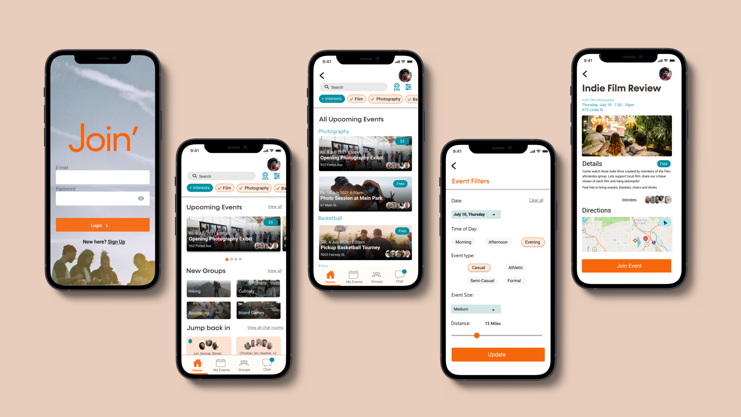
Once an account is made and personalized interests & hobbies are entered users are greeted with the home screen with upcoming events, new groups, and the chance to jump back into the conversations in the group chat rooms.
They can see the upcoming events in the map or list view.
If the user knows what kind of environment they want to attend they can use the detailed filter page to find the perfect event they are looking for.
Marketing Page
I designed a mobile & desktop marketing page for Join’ highlighting the goals and three main features of the app.
What’s next for Join’?
The next steps for Join’ would be to build the other main feature ideas that I had in mind for the app specifically choosing personal interes during onboarding, group chat rooms and safety settings.
Key Learnings
Research, research, research. Doing more in-depth research gives solutions more validity.
Don’t be afraid to dig deeper and explore many possible solutions and design iterations. Asking myself more questions like: Are there other ways to decrease the feeling of isolation beyond a social app? What other demographics am I accidentally disregarding with my solution? This is something I want to do more of before moving forward with a design solution for my next projects.
View Next Project


