Tumblr Likes Filter
A concept for a new feature that allows users to quickly sort through their collection of “Liked” posts on the social media site Tumblr.
Project Type: Independent Project
Role: UX / UI Designer
Secondary Research
User Surveys
Task Flows
Wireframes
User Testing
UI Design
Tools: Figma
Duration: 8 weeks
Overview
This is an independent project that started from a re-occuring desire for a way to find lost posts that I have saved through Likes on the social media site Tumblr.
Tumblr is a website where people can create their own blog to post and share whatever they want. Photos, writing, videos, and music on any subject or theme of choosing while others can share and interact with each post.
What are Likes?
On Tumblr, users can “Like” a post by tapping or clicking on the heart logo. Once a post is Liked it is saved on the user’s profile under a list called “Likes”.
Problem Space
As a long-time user, over time I have saved thousands of Liked posts of outfits, models, illustrations, funny or inspirational posts, and more. But as of right now Tumblr does not have any system in place to categorize or quickly filter liked posts. The only way I would be able to find a post I Liked two months ago, would to be keep scrolling until I eventually found it. Who has time for that?
If Tumblr had a way to categorize and quickly find Liked posts, what would that look like? Are there other features that could be enhanced or added to the Tumblr experience?
Research
Secondary Online
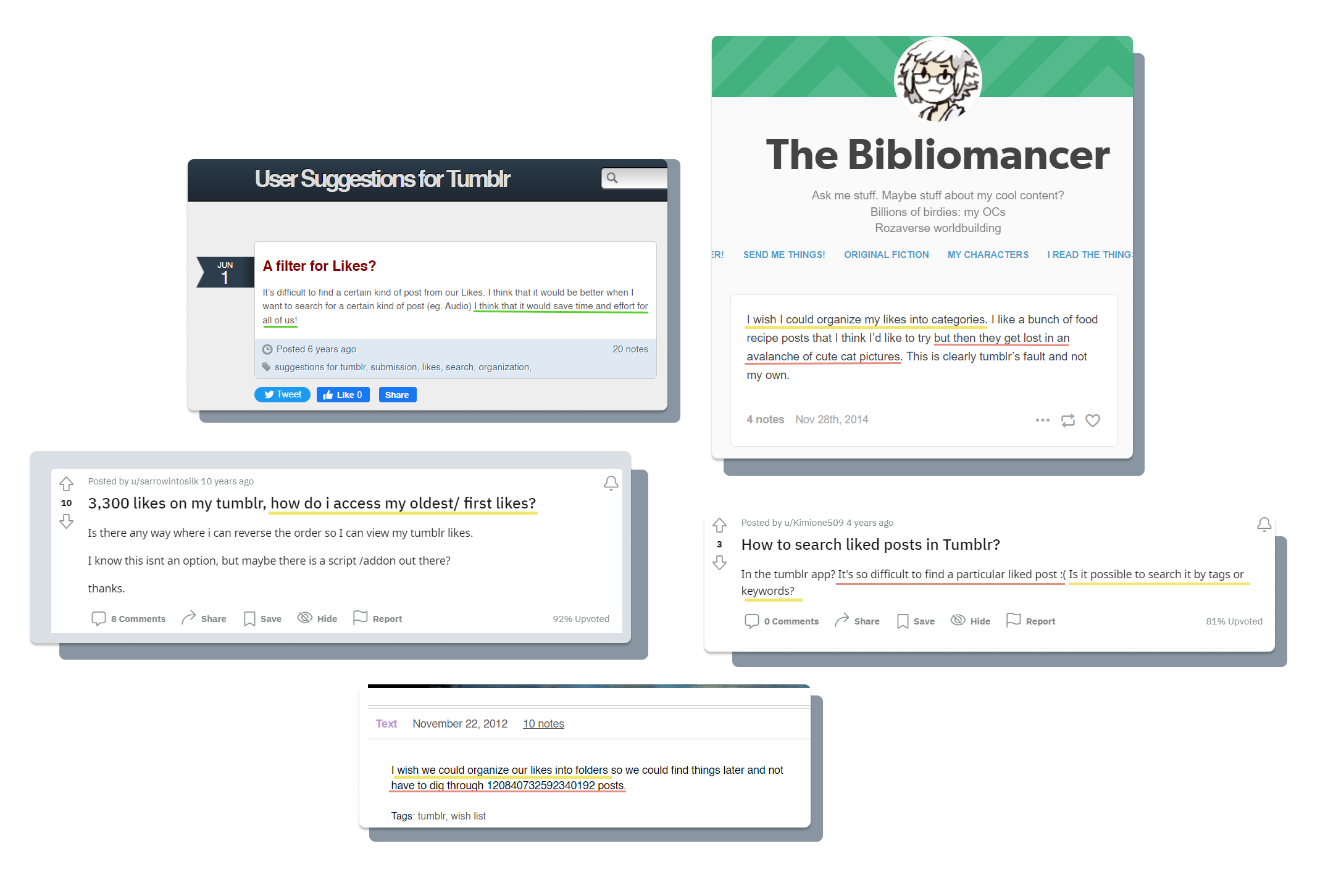
Before moving forward with this idea I wanted to see if I was the only one noticing this problem. So I searched online and quickly found out that I was not the only one who had this problem of wishing they can find past saved liked posts in their Likes.
From my initial search of the problem highlighted in the above examples, there were three main ways that people would have liked to organize their likes:
By order / date first Liked
By group of related posts
And by the type of post (for example: Image, Audio, Text, etc.)
Survey
Now that I confirmed the lack of navigation in Likes was a problem that existed for others, I needed to find out what current users use Tumblr for, why they decide to like a post, how they use and interact with their Liked posts, and to see what possible method of filtering would be the most desirable.
While doing user interviews would have been ideal for getting detailed responses to my questions, I found that I was having difficulties in finding qualifying participants who would be open to being interviewed. I decided to conduct a survey and found that I had received more responses through this method and moved forward with my project with the information gathered.
I received responses from 9 semi-active to active Tumblr users and used an affinity map to help organize their responses into common themes:
Survey Insights
I discovered in my survey that participants decide to Like a post instead of reblogging it in order to save it to reference later for a variety of reasons. These reasons include going back and reblogging it later, saving instead of posting because it doesn’t fit their blog aesthetic, or showing support to mutual followers or friends.
The most desired mode of the organization was being able to filter and search by the date a user Liked a post, followed by creating a personalized category for Likes, then filtering by the media type of post.
When asked why each method was the most desirable for them, 5/9 participants said that they would rather have something flexible and have the ability to sort their liked posts more than one way. So I decided to try to make a filter that includes each option.
Key Learning - Not everyone uses a product the same way.
I got to see from some of the answers from my survey that not everyone uses a product the same way I do. Seeing how others use Tumblr was so different from the way I used it, that it didn’t make sense to me. It made me realize that a problem for me, may not be as big of a problem for everyone else. Thus, the reason to do even more user research before deciding whether or not it is worth it to build a new feature or change existing ones.
Competitor Analysis / Design Inspiration
I took a look at three other content-curation-based social media sites, Pinterest, Instagram and YouTube, to see their UI patterns for sorting and saving content to gather ideas for my Tumblr Likes filter task flow. I specifically looked for and compared the flows for creating themed groups and adding content to those themed groups since this is an element that Tumblr does not have.
Task Flow & Wireframes
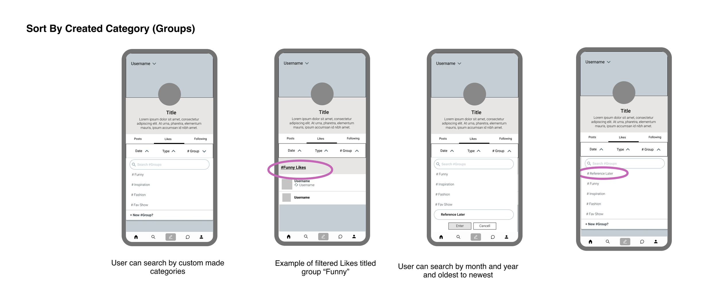
After discovering the common user flows found from competitor social media sites, I mapped out the task flow and created matching wireframes for categorizing Likes from the home dashboard and filtering Likes from the user profile page.
For this project, I did not want to alter or change the current Tumblr interface design. Instead, I wanted to figure out where and how a filter tool could be included on a user’s Likes page with the current Tumblr designs.
Key Learning - Small features can cause big changes.
The impact of adding a new feature that might be perceived as simple or small can create a whole new set of questions that need to be answered. This project caused me to consider all the changes and new possible interactions with the product that would need to be implemented in order to make sense. Where does it lead? Where do users find this button? How does it alter or change the current page? etc.
User Testing
I did one round of user testing with five individuals to get feedback and impressions of the filter. After completing the user tests of the filter, opportunities for slight improvements to my initial wireframes were discovered.
For some of the improvements and changes made, I decided to incorporate the current Tumblr design elements into my filter.
Change date entry format
One tester commented that typing in and adding the date would be tedious. Plus there was a possibility the user would accidentally search for a date when they weren’t a user and didn’t have any likes to show.
So I borrowed the drop-down date menu already existing in the Tumblr Archives feature, where people can search and filter others’ public blog posts.
Improving filter flexibility & visibility
One point of confusion was knowing what filter was activated, and how to quickly clear a filter.
To make the individual filters more obvious and to quickly have the option to clear filters, I again borrowed the current interface Tumblr uses for such filtering on the main Explore page.
Confusing Terminology
Multiple testers were confused by the name “#Groups” I came up with for the custom categories. They were not sure if it had any relation to the existing hashtag meaning and functionality on Tumblr.
The solution I made was to take away the # and simply call the custom categories “Groups”.
Simplifying New Groups From Dashboard
When creating a new theme, one user felt like there were too many steps in the process. I took out one step in the flow so that after a new Group is created from the dashboard, it would automatically be added to it.
I also made the “New Group Name” entry prompt fill the screen instead of navigating such a small space.
Final Prototype
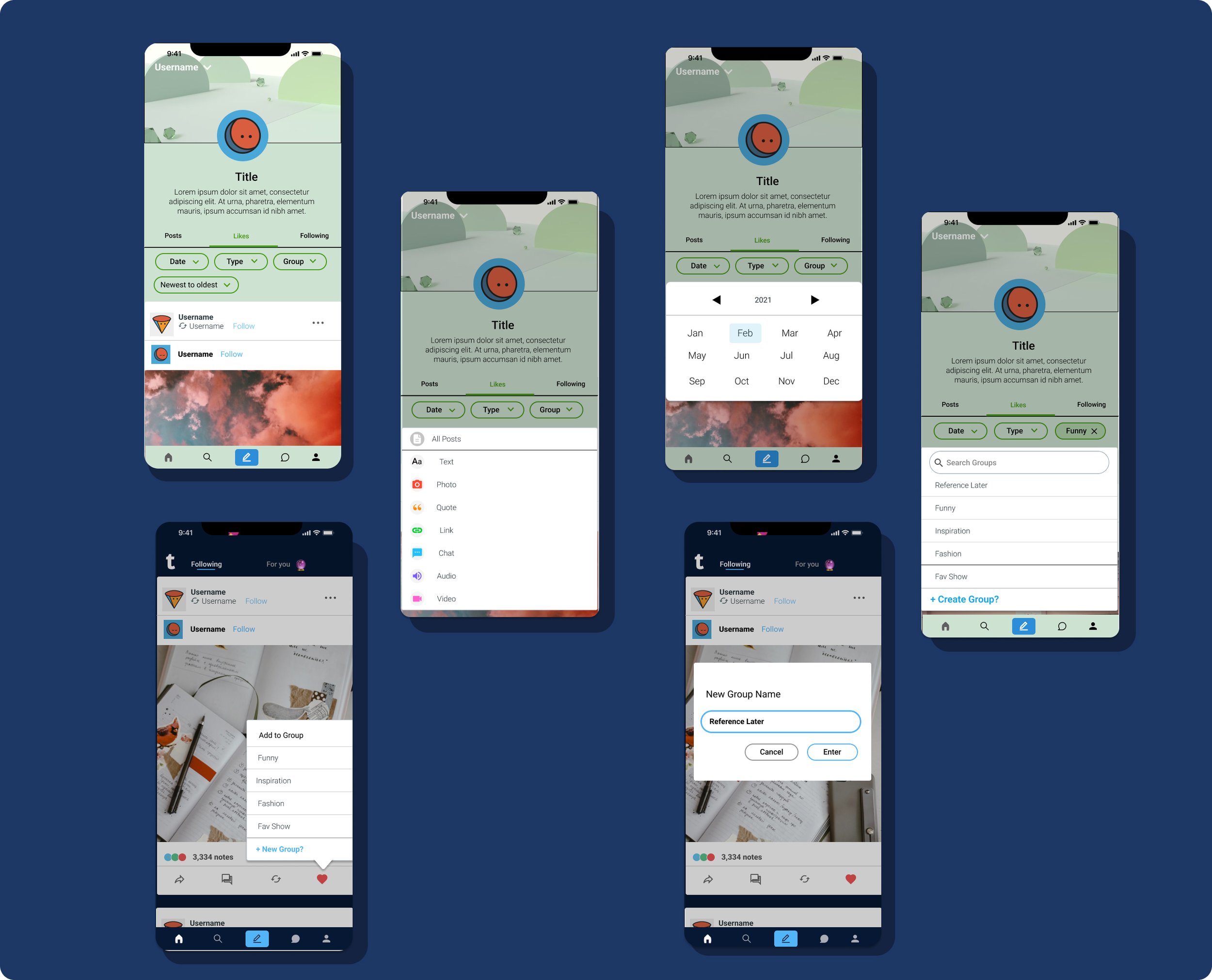
Filter In Action
Users could now quickly jump to posts they liked as far back as when they first started using Tumbr if they wanted.
Users would be able to quickly isolate and find text posts, audio posts, video posts, or more easily.
Users would have a way to categorize their likes so that they can be easily referenced or found again for whatever reason.
Making new groups from Dashboard
From the dashboard users would have the option to categorize the Liked post by clicking on the prompt “add to Group”.
From there they have the chance to add the post to a Group that was previously made.
Or if they wanted to start a new group with that liked post, they can create a new one from their dashboard and it would be instantly added to the new group.
Outcomes
During my user tests I had asked each tester how the addition of a filter to organize their likes would affect their experience on Tumblr, and this is a summary of what they said:
Overall it would be a positive and interesting improvement to the app for them. They all said that it would draw them back to engaging with the app to organize their likes in groups and go look at what they liked in the past.
But. Several of my testers also mentioned that because of the decreasing activity and major changes to the type of continent allowed on the platform, they were not sure how much longer they would continue to be an active user after the launch of the hypothetical new feature. It would be interesting to measure how much of an increased engagement building this feature could actually bring to Tumblr.
View Next Project


